Color Balance
What makes a good coordinate? The dress and traditional accessories are enough to make a good coord, but what makes an exceptionally, amazing coord? What makes a coord memorable and unique?
In my opinion, a good coordinate can be like art. Just like in art, one of the basics is balance. I'm going to focus on color balance.
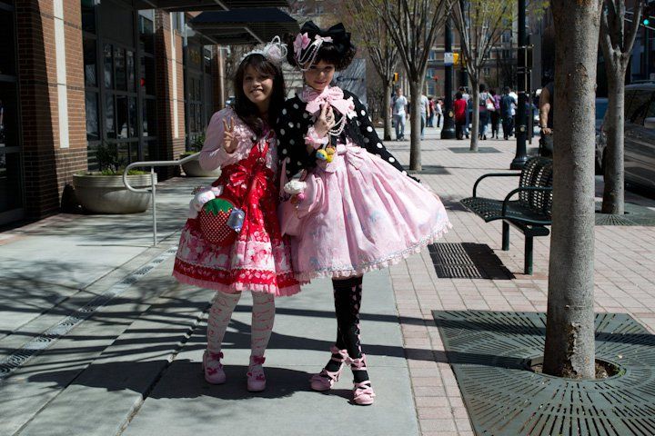
Both of the Lolitas in the pic are friends of mine, and both are good examples of color balance.
Whipcreambunn, on the left, successfully mixed red and pink together by not allowing the red to overpower her coord. She uses the red as her main piece with her dress, but also as her accent color with her purse and shoe clips. She framed the red with a light pink bolero, OTK's, hair accessories, and shoes.
I think this is a great example of great use of a strong color that a lot of people can't pull off. I know that for me, red can be tricky and can easily wash me out, but Whipcreambunn separated the red from her face with the bolero and then balanced it out by wearing matching OTK's. The purse is a great accessory as well because it doesn't contrast against the red and in that respect, the colors do not dominate each other.
Stina, on the right, has done something very impressive with her coord. It isn't easy to successfully mix black into a pastel, sweet coord without some form of black accent in the dress or without having a cute, goth theme.
I think the number one reason this cood is successful is that her black elements aren't completely black. Her cardigan and her OTK's have polka dots and hearts that break up the dramatic accent color.
Just like Whipcreambunn, she has framed her pastel dress with her accent color, but each element doesn't dominate the other. She uses an interesting way to bring the pastel pink to frame her face with the bow on her collar and the bow brooch in her hair. Her shoes are pink as well and match the accent in her socks while breaking up the black.

Wunderfluff's Jewelry Jelly Coordinate
She brought in a third color by adding a pink bonnet and balancing it with the pink in her scrunched leg warmers and wrist cuffs.
Very good use of an accent color that doesn't seem so common in Lolita fashion.

Keana put together a stunning royalty themed coord for our community's annual high tea event.
This coord is all about her focal accessory, the sash. Keana took an all white skirt and blouse and added a pop of bright, cobalt blue while leveling it out with gold accents, a reflection of the sash itself. I especially love the touch of gold she added with her Jeffery Campbell's. The blue isn't overpowering and the gold is used in just the right amount. Some might see it as simple, because it isn't OTT, but I think it's bold and unique to the individual style Keana has developed.

Brandy's coord demonstrates that classic can be as bright and bold as any sweet coordinate.
I love that Brandy has taken elements from two street fashions and blended them together for this beautiful coordinate. She balanced her Haenuli skirt with a matching wig and tights while making sure the bright color doesn't overwhelm the ensemble by wearing a cream blouse and muted peignoir. She emphasized the Dolly Kei elements with her accessories and black belt, which she balanced out with matching black shoes.
Thanks for reading! All I have permission from all the Lolitas featured.
-Lovely Lunette
-Lovely Lunette

Do u have a Pinterest account also?
ReplyDeleteSorry for the late reply! I do have a pinterest account! http://www.pinterest.com/lovelylunette/
Delete